A User Experience Designer
OSMF
Project Overview
The Ontario Summer Music Festival (OSMF) App is a companion app to a fictional music festival that is to be taking place over 6 venues in the city of Kingston. The app helps the festival attendees, a lot of whom will be travelling from other cities in Canada to manage their travel, stay and experience. I was the sole UX/UI designer on this college project, which initially required me to create interactive low-fidelity prototypes. However, I decided to continue working on it as a personal project and developed a high-fidelity prototype for parts of it.
Problem Statement
Project Goals
OSMF is a companion app for a fictional music festival in Kingston, which provides a single platform to take care of any travel, accommodation or food needs and provide information about the festival. The challenge was to design the information architecture, layout and navigation of the app in the form of a low-fidelity prototype in 2 weeks using programs Balsamiq (which I never used before this project) and Marvel POP.
Later on, after I decided to continue working on this project on a personal capacity, the challenge was to create a high-fidelity prototype for parts of the app and apply interactions to it in Adobe XD (which I had never used for interactions before this project.
Storyboard
Design Proposal
I decided to design the app for an iOS environment (for a 16:9 aspect ratio of the iPhone SE and above, leading up to the iPhone X). I began by looking at different methods other apps used to communicate the type of information that needed to be included in the app. Additionally, I reviewed the Human Interface Guidelines by Apple and simultaneously sketched a few iterations of the different screens I wanted to include.
Research Methods
I created a storyboard to demonstrate the user experience through a few key images without needing to be text-heavy and to communicate a use case of the app. It also helped me to chronologically understand the flow of use for the app.
The primary goal for the project was to design an app that was easy to use and navigate through. Additionally, the personal goal was to understand the use of various design patterns and learn how to create a prototype using Balsamiq and Marvel POP. Lastly, the goal was to learn Adobe XD and the interaction tools in it.

Sketches
Splash/Log in Screen
I decided to include a splash screen after being inspired by the majority of applications out there that use this technique. This screen is a great way to introduce the user to the app and the brand while processing the launch of the application in the background. The idea of functioning that I had with the splash screen is to have the logo appear first and be the focus of the screen, and then for it to slide upward with soft animation, disclosing login/sign up buttons.
I included the concept of user accounts so that users could log in and out of the app and also make purchases. While the feature is not included in the current iteration of the app, it is something that I envisioned to be added in future versions. Having an account system could prove useful in saving payment details (if customers choose to), save receipts of payments, add security and, most importantly, save tickets for the festival at a convenient location to then later access it. The option of logging in using Google and Facebook accounts also adds to the convenience a lot of users may prefer.


Wireframes - Log in screen


Prototype - Splash/Log in screen
Home Screen
Considering that the user will use this app in preparation for attending the music festival to explore the locations and plan their trip, I wanted to have something on the home screen to promote the festival and get users excited for the same. This is why I decided to have a countdown on the first page of the carousel, counting the time left for the festival to start. This space would alternatively display the ‘up next’ screen, showing who the next performer would be and where/when will they be performing. To continue with the plan of promoting the show, I decided to include some selected social media posts made by fans with the hashtag #OSMF.
After researching different ways to showcase information that I wanted to appear on the home screen, I found the technique used by Apple App Store to be the most appropriate. This comprised a carousel of clickable images at the top, which the user could swipe to look at different content while having widgets in the bottom half of the screen (the usage of widgets is apparent, particularly in the Health app available for iOS). This allowed me to include the countdown and social media posts in the carousel and also include the major resources that the customer could access through the app in the form of widgets.


Wireframes - Homescreen


Prototype - Homescreen
Hamburger Menu
I decided to use the Hamburger Menu due to its capacity to display a lot of content. As I wanted to split the app into 6 primary resources, it would have been challenging to share the tab bar amongst 6 icons without hindering usability and legibility.
Apart from this, the hamburger menu is part of the users’ mental model when looking for categories or looking for ‘other things to do’ in an app. This is also part of the reason why I have included the My profile, Contact us and Log out sections in the hamburger menu, catering to this mental model and improving accessibility of information.
.png)

Wireframes - Hamburger Menu
Travel Screen
To ensure consistency throughout the app, I continued to use widgets with supporting imagery in the Travel screen and some of the other screens. The order of these widgets is determined by the popularity in use. A presumption is that most people would drive to the festival (or walk between locations at the time of the festival). On the other hand, others would take a bus, a train or a flight in that order (flight appears last as the festival is set to take place in a small town and fans from distant/overseas cities are less likely to visit).
The walk/drive functionality is in-house and allows the user to navigate from point A to point B and is parallel to the functionality in google maps. On the other hand, however, the bus, train and flight functions are to be in conjunction with third-party websites. To communicate this, I have included an external link indicator as part of the widget (due to the limitations of Balsamiq, I could only use the ‘export’ icon to imitate this). This will communicate to the users that tapping the widget would take them to a third party (or a travel partner, depending on marketing and partnership arrangements). Additionally, doing so will trigger a modal window, advising the user that they are about to leave the app.


Wireframes - Travel Screen


Prototype - Travel Screen
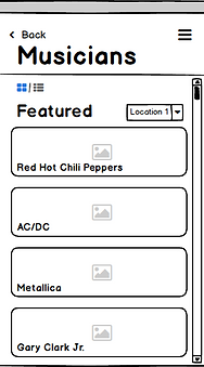
Musicians screen
The Musicians screen, just like the travel screen, is structured using widgets when in the Featured mode. This mode arranges the names of artists and bands performing in the festival by their popularity. This works for known-item seeking as the users could select the artist/band they like and look for information about when and where they will be playing. Alternatively, users could choose to switch to the List mode if they prefer the berry picking method of seeking. The List mode allows for chunking of artists/bands based on the day they will be performing, in chronological order of their performance times. Both of these modes can be sorted by location, hence showing performances lined up for specific locations, helping users to look for information relevant to venues of their choice.
When you dive another level deeper into the Musicians section and tap on the name of the artist/band, they will be shown the artist/band’s profile page with a cover photo and the title. This layout was inspired by the Apple Music app and its artist/band page. The cover picture takes centre stage, introducing users to the artist/band. To maintain consistency and add to the usability, I decided to also show information on this screen about when and where that artist/band will be playing. For further convenience, I added a button that allow users to listen to that artist/band on Spotify, allowing users to take the pearl-growing approach, where they could discover more artists/bands similar to the selected one. Another feature added for user’s convenience is the ability to navigate to the location where that particular artist/band is playing.


Wireframes - Musicians screen
Concert Locations screen
To make sure that there is an appropriate distinction between the navigational section under the ‘Travel’ screen, I decided to have a static map showcasing the six different venues. Users could select individual venues that will bring up a pop-up dialogue box informing the user of the name of the venue and the upcoming performance details specific to that location. This is to ensure that users have vital information available through multiple resources. Additionally, it provides users with an option to find directions to a particular venue.


Wireframes - Concert Locations
Stay and Eateries screens
The basic structuring of both, Stay and Eateries screens, is similar, in that both these screens are supported by widgets. The Stay screen’s widgets showcase a carousel allowing users to view photographs of the listed accommodation, along with the nightly rate of the room and ratings. I chose to have specifically these three pieces of information to be shown in the preview, as they are presumably something that users would prioritize. As opposed to this, the Eateries screen displays the name of the restaurant/cafe, the ratings and a series of dollar signs indicating the approximate expense that a user could expect at a particular restaurant. This is a design pattern popularized by its inclusion in google searches for restaurants. Results for both of these screens can be sorted by cheapest to most expensive or by ratings.


Wireframes - Stay and Eateries
Miscellaneous design patterns and elements
Amongst some others that I have mentioned in the document, I used some design patterns throughout the app, to reduce cognitive friction and stay in line with users’ mental models. One of the most notable ones is the appearance and location of the ‘back’ button. It uses the back button style of iOS and hence more familiar to iOS users. In conjunction with the back button, I envisioned the app to have the gesture of swiping from the extreme left of the screens to the right, which also allows users to go to the previous screen. I have included coloured buttons on some screens for a call to action.
Additionally, the layout of the title for each screen is similar to the screen layout of the current iOS screen. The various buttons throughout the app and a few modal windows also follow the same path as elements listed in the Human Interface Design.
Key Learnings
This is the first project that I designed mock-ups and prototypes for. It was a fulfilling experience as I went through the transition from being a user to being a designer. It forced me to think about the current design patterns and the reasons why they exist.